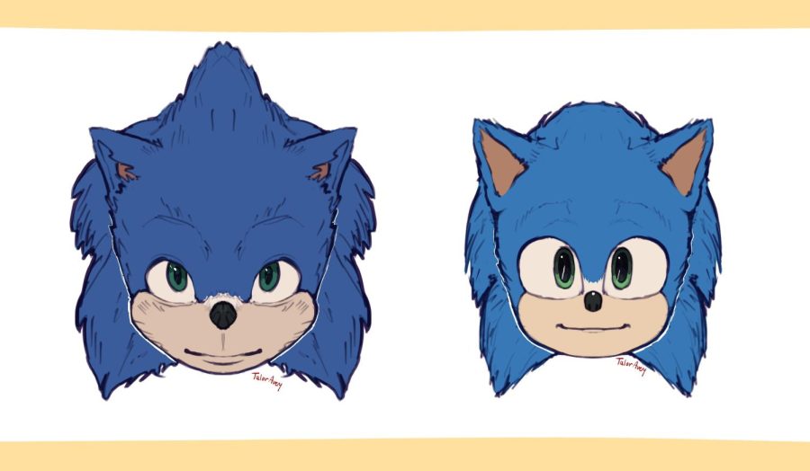
The Big Change: Sonic The Hedgehog’s Transformation
What makes anthropomorphic characters in Sonic movies cute?
Sonic the Hedgehog is the beloved, well-known, blue hedgehog who’s been running around for decades. He’s fast, snarky, and has a captivating presence that draws in the numbers.
Established in the 90’s, the blue hedgehog has become a huge presence in the 20th century media. In the year 2020, Sonic was granted his first live action film, “Sonic the Hedgehog”. In this movie, Sonic falls in from space inevitably being turned into a hero to fight the evil Dr. Robotnik. Millions were excited to finally see their favorite hedgehog dash around on the big screen.
However, once the trailer was released, fans broke out in outrage. Instead of a cool transition from 2d to 3d realism with the original design scattered throughout, He appeared uncanny and unpleasant. His usual charm came off as creepy in due to his horrid design. The people hated it. The loath for Sonic’s design was so intense, it led to the movie being pushed forward another 6 months to make room for a design change. Thankfully for everyone, Sonic was successfully transformed into something that could bring a positive outrage from the crowds.
After “Sonic the Hedgehog” did immensely well, the decision was made to produce a sequel, “Sonic the Hedgehog 2”. 2 years later in 2022, fans are blessed with an additional cast of well-loved characters; Tails, an orange twin-tailed fox bestowed with mechanical genius, and Knuckles, a red echidna and last descendant of a well built clan of echidna. Now that viewers didn’t have to worry about any uncanny images of tails and knuckles, there were crowds filled with ambition to see Sonic’s pals up on the big screen.
Though, what about Sonic’s design change made him more favorable? As “Sonic the Hedgehog” is an upbeat PG movie, it naturally should attract viewers with a bright and fun atmosphere. To achieve this feel, something more “cartoony” was definitely the way to go in contrast with eerie realism. For Sonic to be an unearthly being, it’s [ironically] most realistic to have him embrace such animated proportions. The designer’s go-to solution to his design issue was to wipe almost everything about the original design all together.
Sonic was given a new wash of vibrancy and color. Anything with a human or overly-realistic feel was snatched away and replaced with; enlarged eyes, cartoon-like mouth, button nose, and overall smaller body proportions [bigger head, feet, and hands + smaller body] . Best of all, he reappointed his iconic gear, his white gloves and red and white shoes. This gracious style switch transitioned all too well with “Sonic the Hedgehog 2” giving Tails and Knuckles the same vibrant and childlike features.
As much as Sonic’s cuter movie design contrast with styles we see a lot today, it represents the idea of “what if Sonic was in the real world” very well. Young mammals are naturally cute as a protective mechanism due to evolution. In both movies, Sonic is depicted to be a child and carries a childlike nature. Needless to say, it’s a perfectly realistic standpoint for him to have such endearing cuteness. Same ideals applies for his companions, Tails and Knuckles.
The greatest part about the trio’s character design, is that it amplifies their personalities and little quirks that make them themselves. Sonic’s childlike nature and snarky sarcastic attitude is intensified in a more charming manner. Knuckles’ naivety and often occurring misinterpretation for (almost) anything, is effectively more endearing because of his design. As for Tails, he’s already Sega’s staple “cute sonic character”, so his movie design simply enhances that fact.
With the third Sonic movie coming to theaters in 2 years, they’ll introduce numerous more fan-favorite characters to the big screen. It’s heavily anticipated by all fans to see how more Sonic characters will translate in the real world.


